Avitas Systems, a Baker Hughes & GE venture
Leveraging AI & Robotics to Rebuild an Industrial Inspection Platform
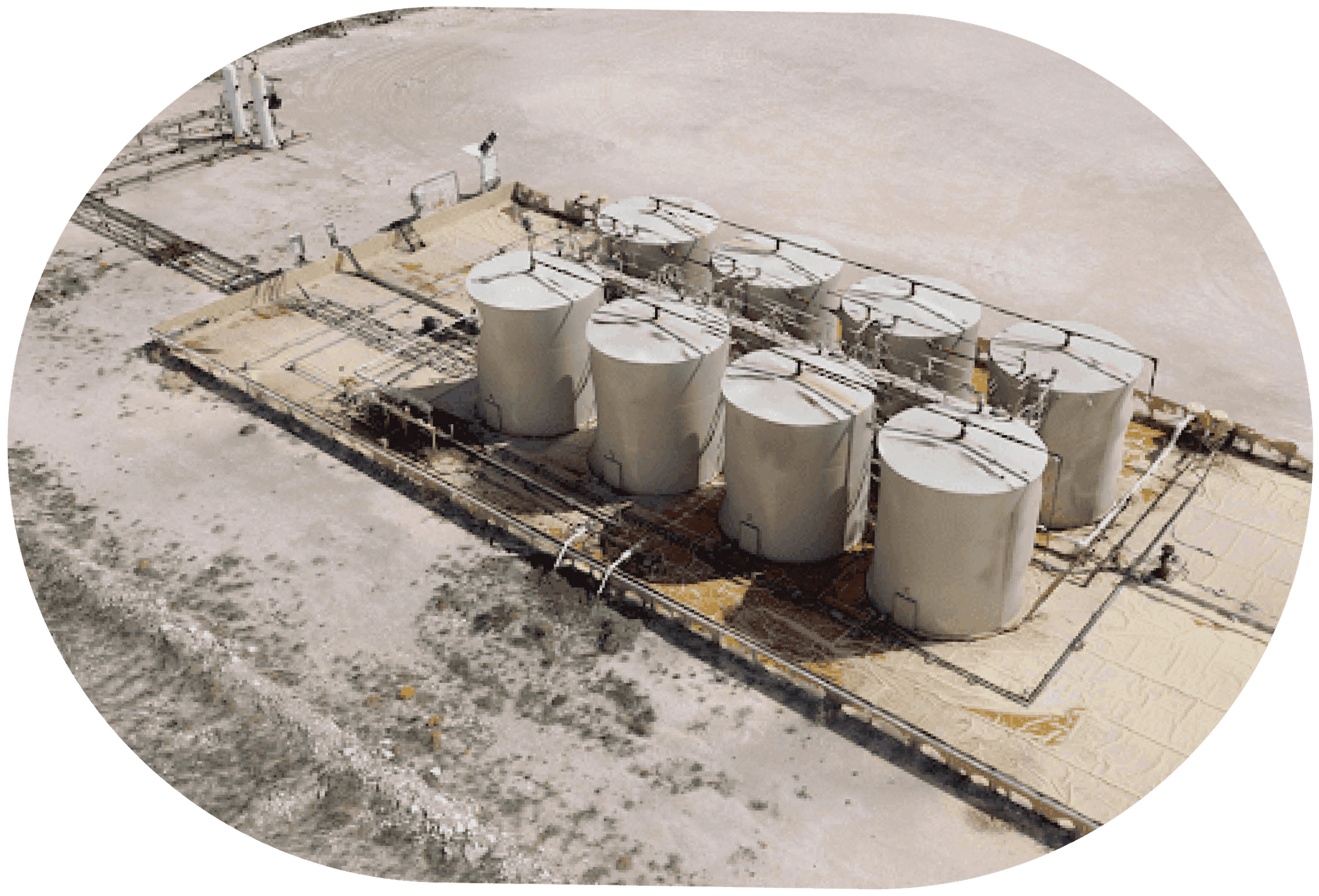
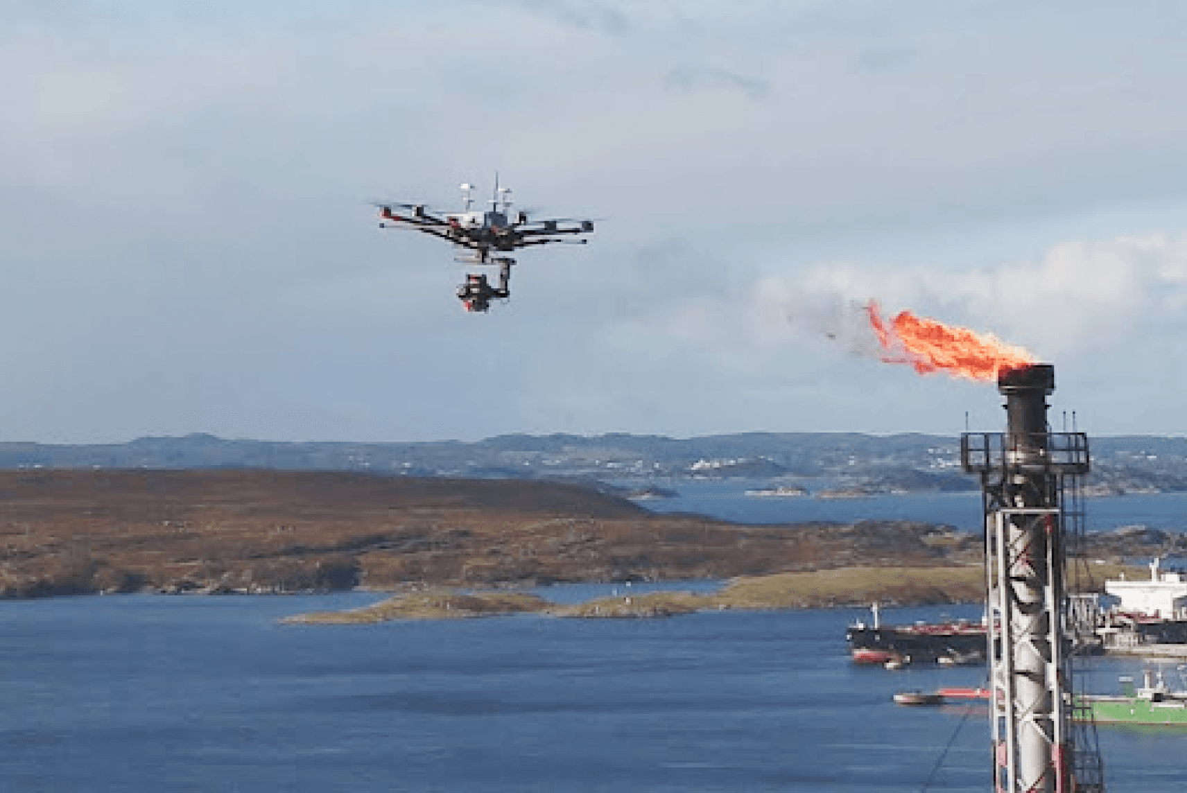
Avitas, launched as a GE venture in 2017 and later acquired by Baker Hughes, aimed to revolutionize industrial inspections through automation, robotics, and AI. Their cloud-based platform integrated real-time monitoring, drone inspections, and advanced analytics, enhancing safety, speed, and cost-efficiency for industries like oil & gas, power, and energy.
As the first and sole UX designer for the initial 1.5 years, I transformed the engineer-built system into a user-friendly, scalable platform, enhancing UI consistency, usability, and workflows. These improvements boosted sales prospects by 35%, enabling inspectors to work more efficiently and make smarter, data-driven decisions.


Timeline
Aug 2017 - July 2018
Role
Sr. Staff UX Designer
Team
0.5x UX Teammate
2x Executives
6x PM’s
4x Data Scientist
20x Backend + Frontend Dev
2x Customer groups
Impact
Increase development efficiency by 40%
boosting sales prospects by 35%
Constraints
Limited design resources
Build from ground up
THE PROBLEM
Fragmented Workflow, Inconsistent Design, Poor Usability, Lack of Essential Capabilities
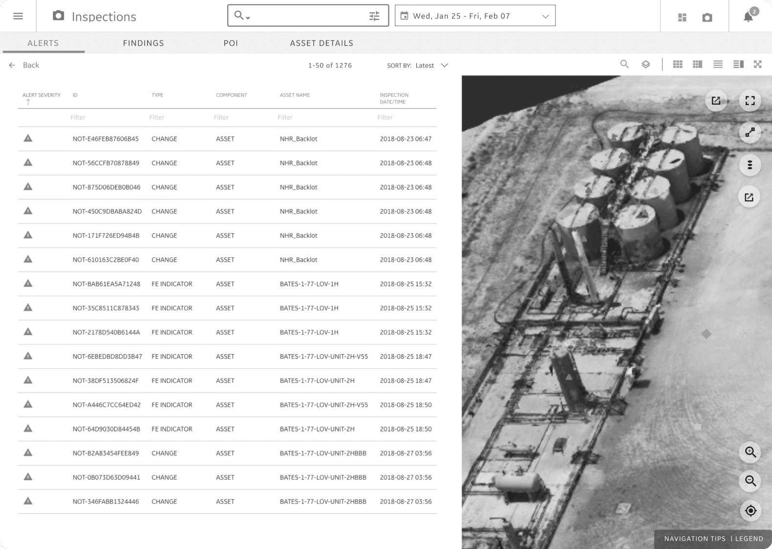
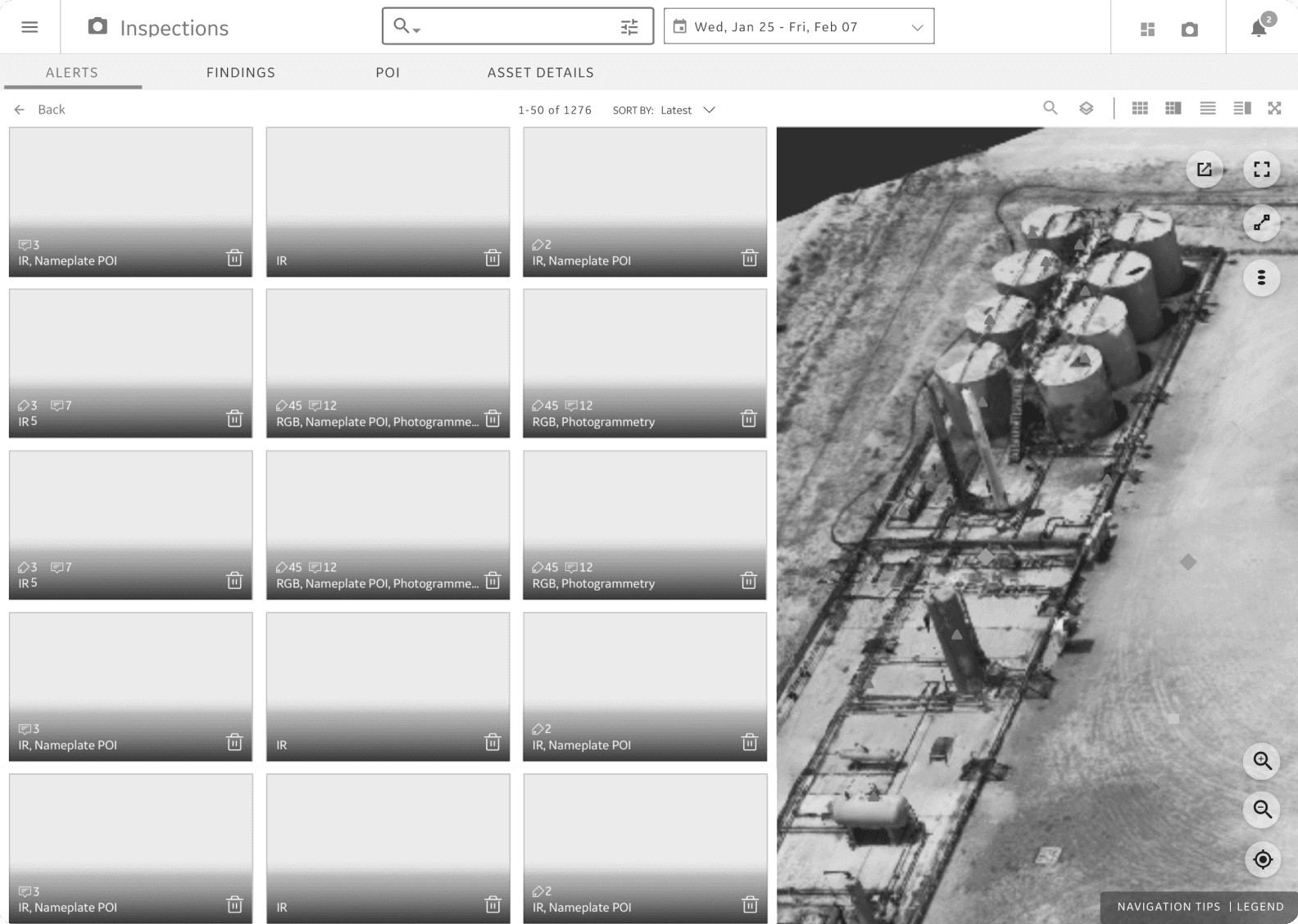
Inspectors faced a frustrating workflow, repeatedly re-entering and searching asset data across Dashboard, Inspection, and Report features. The platform lacked essential tools like search, filtering, and contextual insights, resulting in a disjointed, inconsistent experience. For industries needing continuous monitoring, this made extracting insights and taking action inefficient.
Before
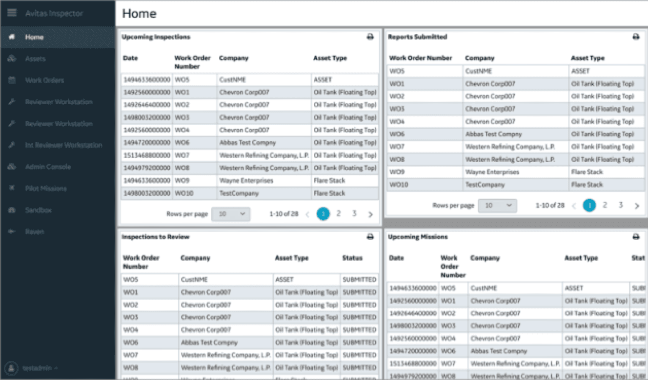
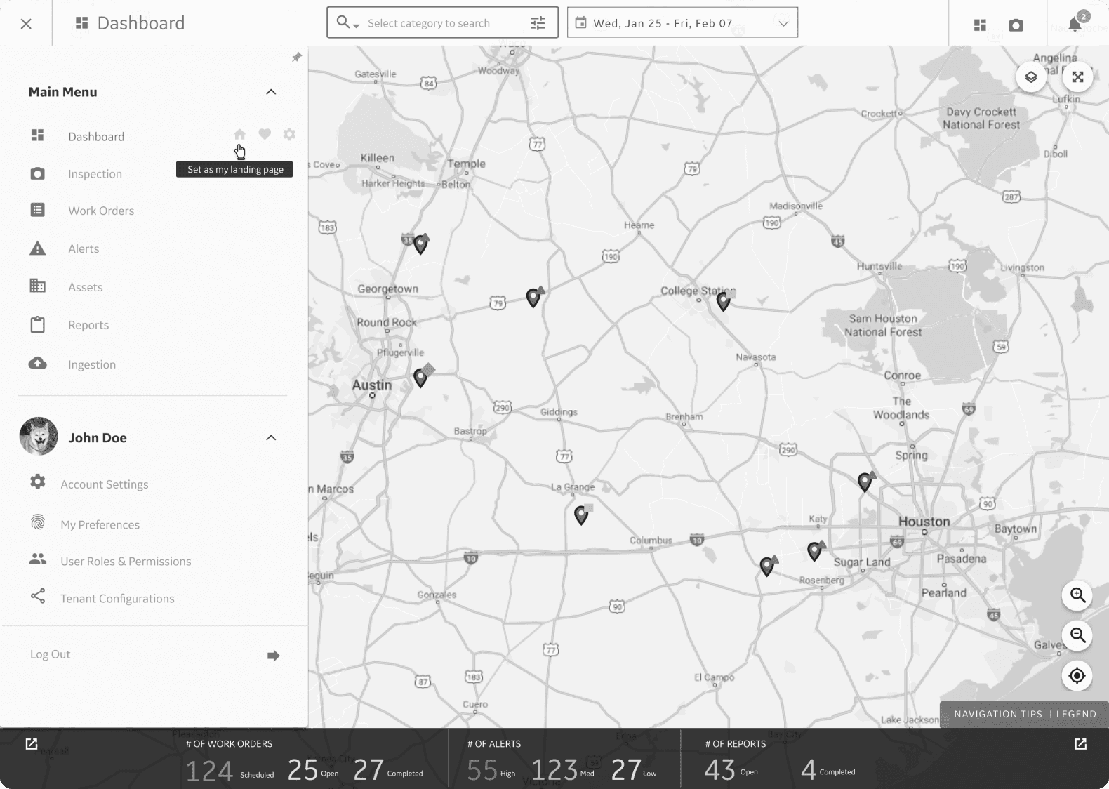
Custom dashboard A
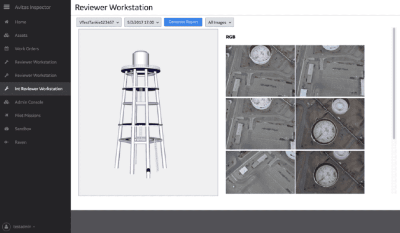
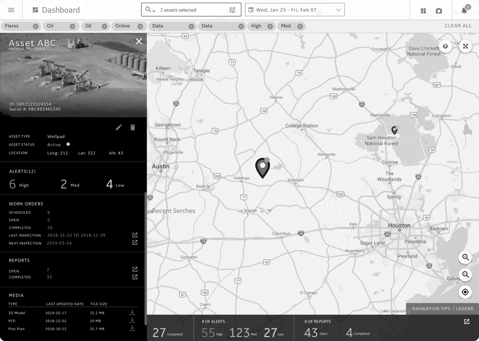
Asset Inspector Page
Custom dashboard B
Inspection detail page
What Works 💚
Key Features Identified:
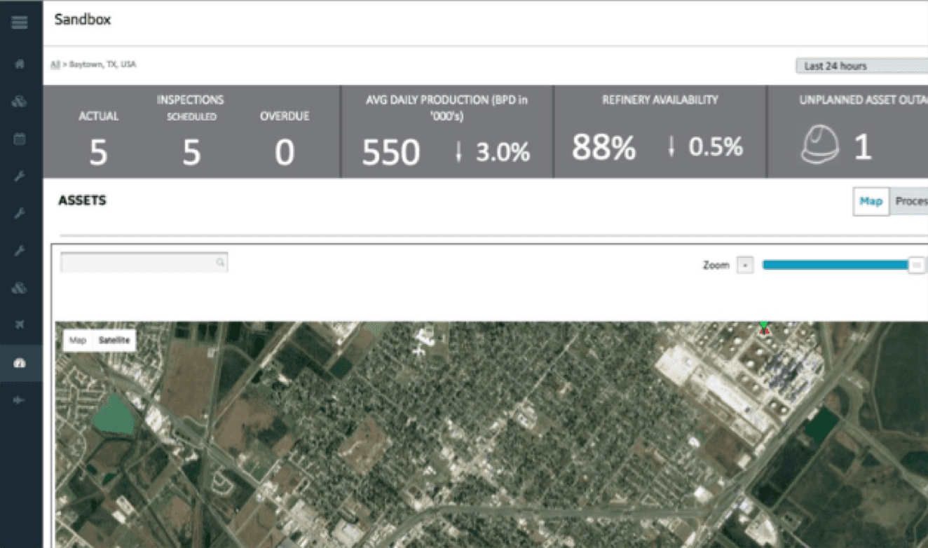
Dashboard: High-level summaries provide essential overviews.
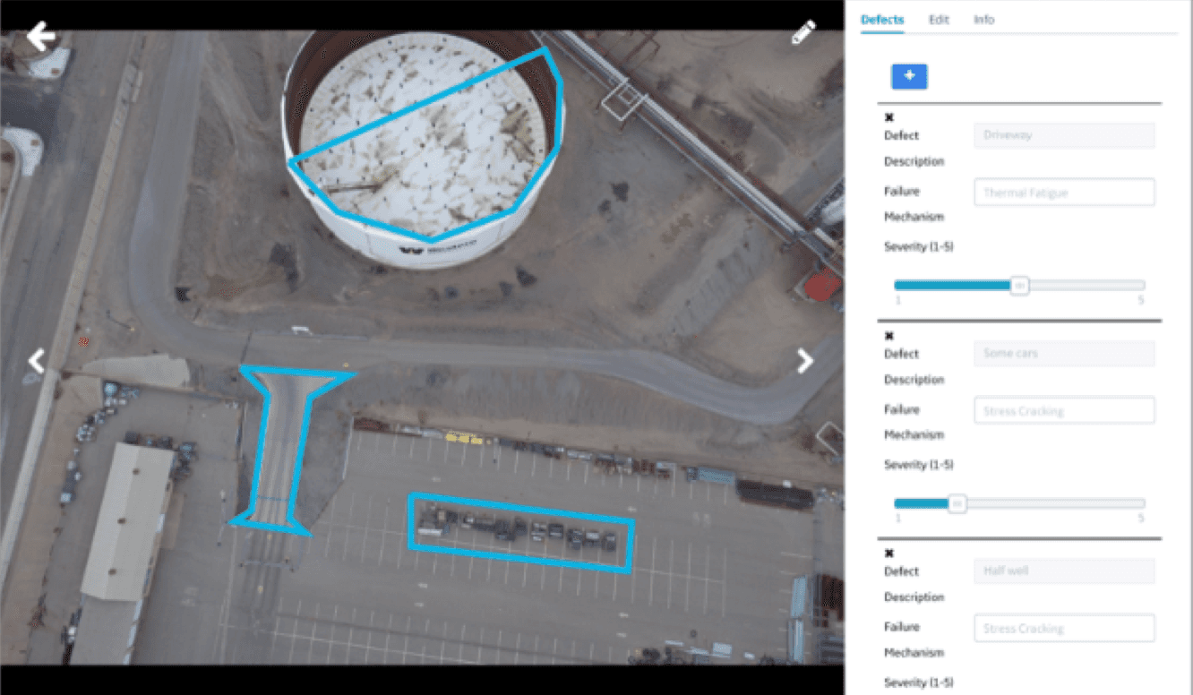
Inspection: Visuals and details of problem areas are crucial for analysis.
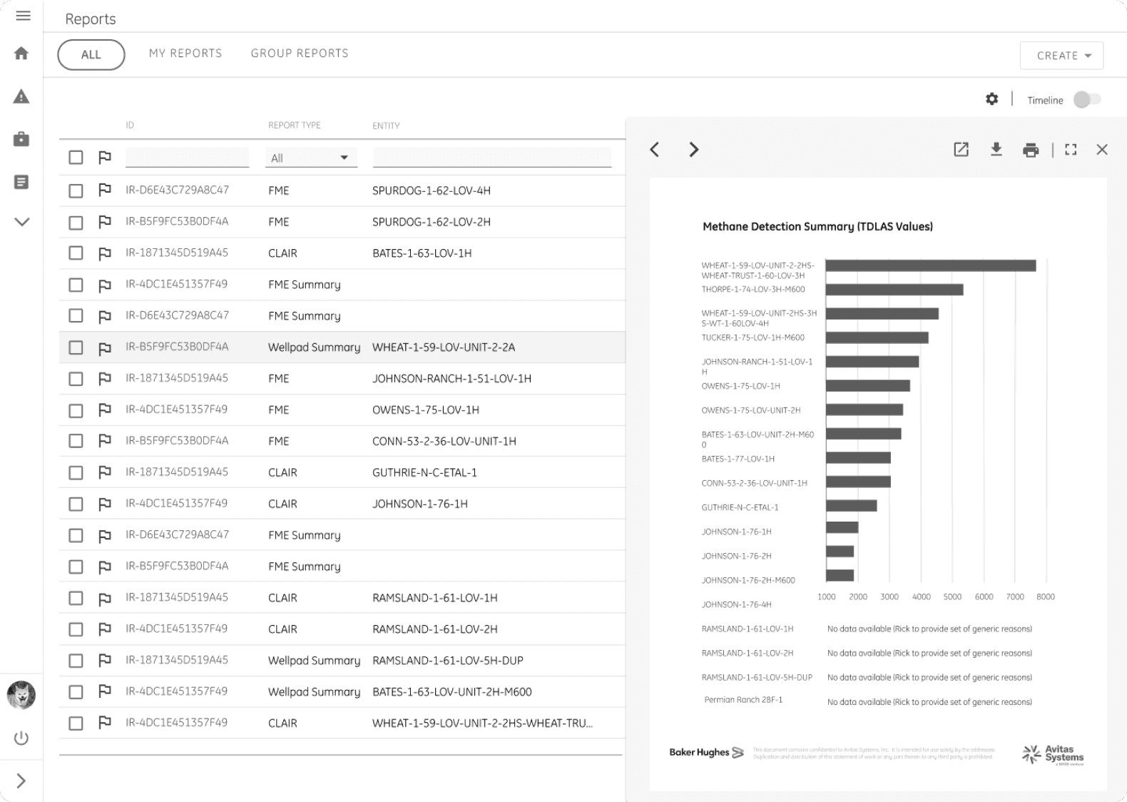
PDF Report: Meet regulatory, repair, and daily stand-up needs.
Custom-Tailored to Customers’ Needs Based on Industry
What Doesn’t ❌
Inconsistent Design: Messy, unstructured screens built by engineers without design guidance or global CSS.
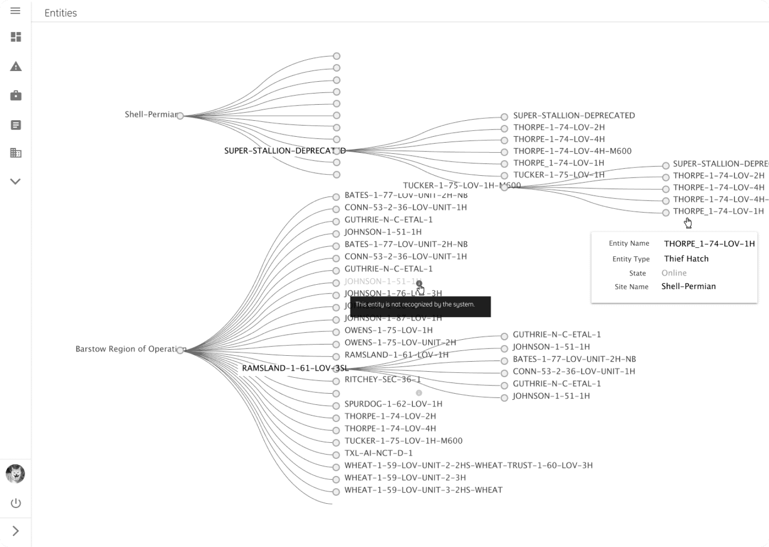
Context Loss: Platform failed to maintain context across features, disrupting workflows.
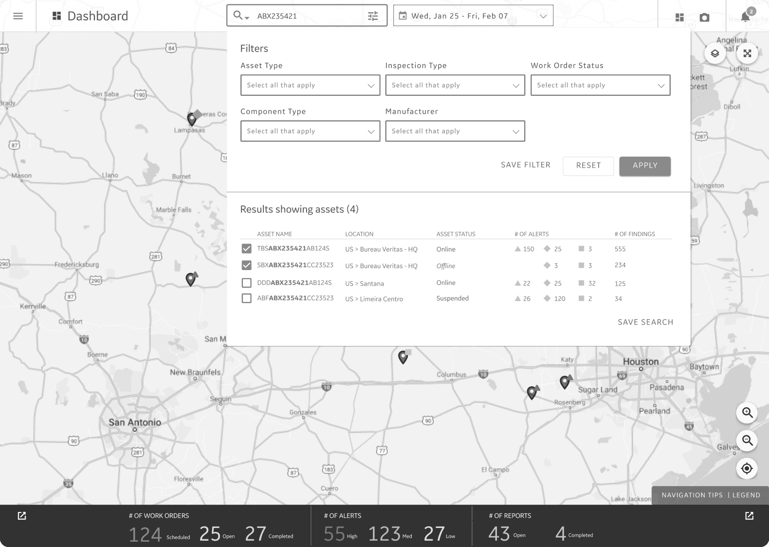
Lack of Search & Filtering: No efficient way to locate relevant data quickly.
Incomplete Reporting: No effective way to visualize or find historical reports.
No Scalable Strategy: The team relied on building one-off demos, wasting time and effort without a cohesive, scalable approach.
DESIGN GOALS
01. Creating a Consistent, User-Friendly Interface
02. Ensuring Seamless Navigation Across Features
03. Design Efficient Search & Filter
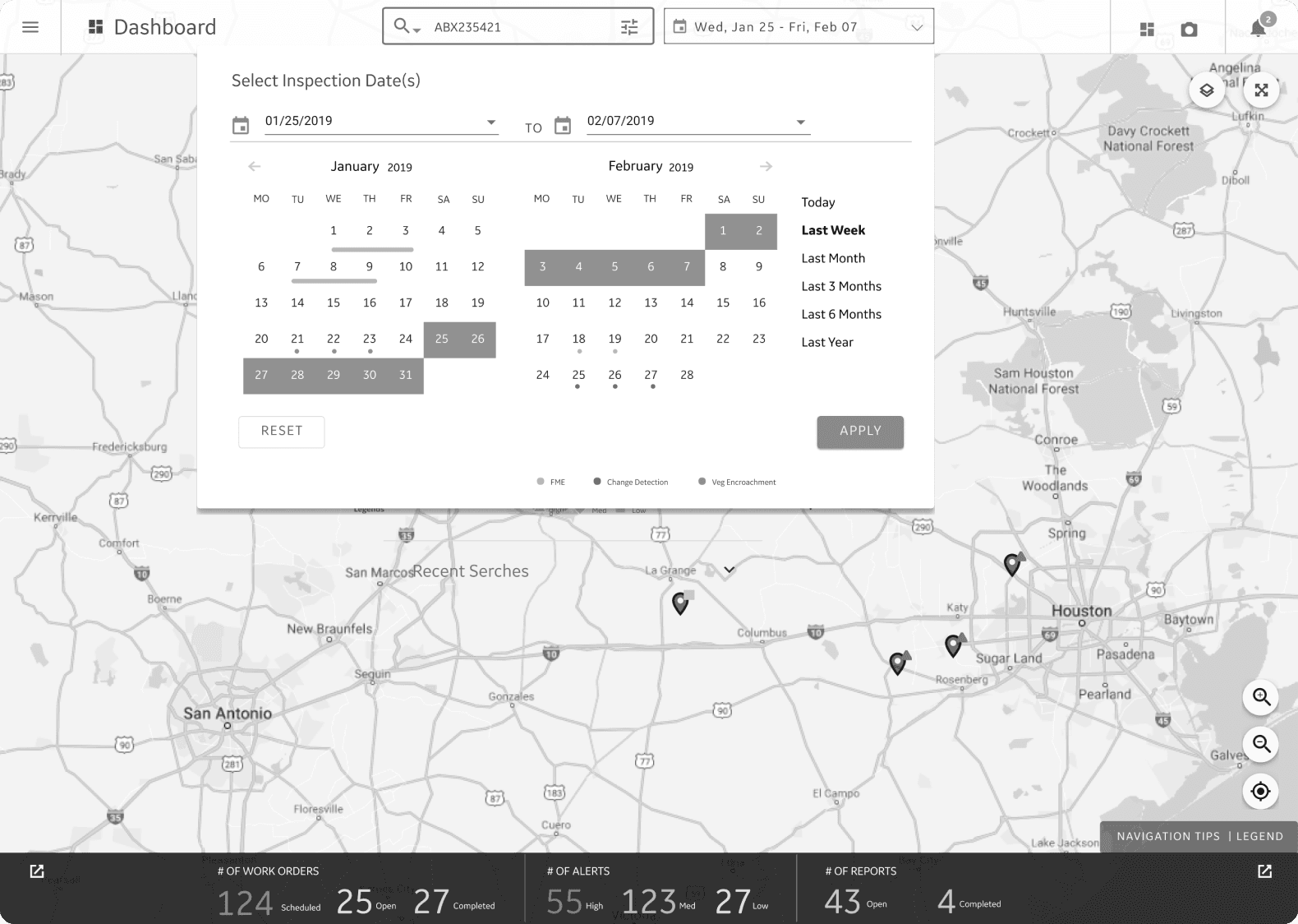
04. Building a Centralized, Timeline-Based Reporting System
DISCOVERY
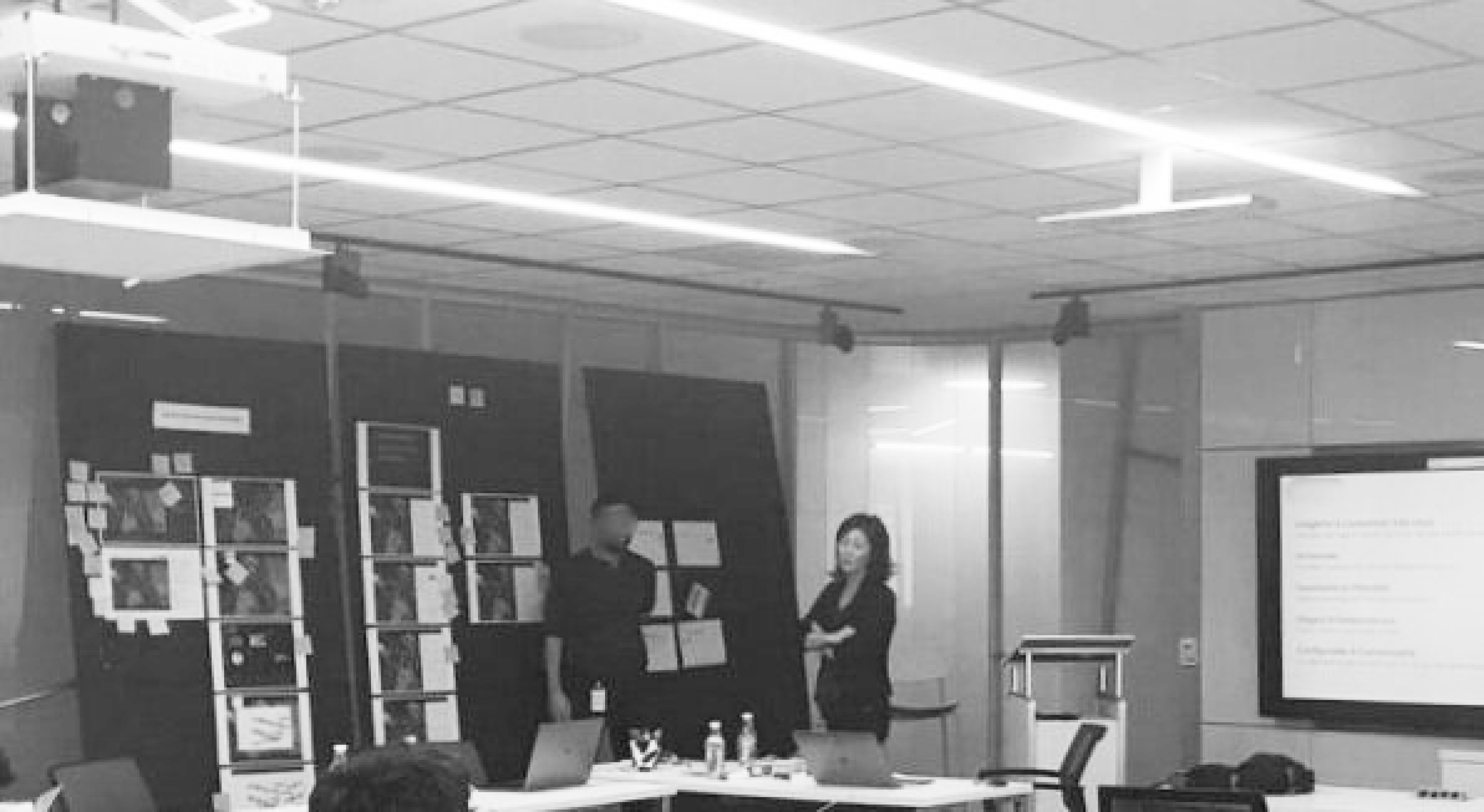
Stakeholder Interview
To achieve these design goals, I began by interviewing six PMs individually, each managing different customer accounts and industries. Their unique perspectives provided valuable insights into the platform’s purpose and target users.
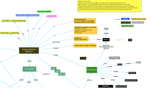
Using this feedback, I created a concept map that aligned business goals, defined target personas, and visualized how existing features and workflows were interconnected.
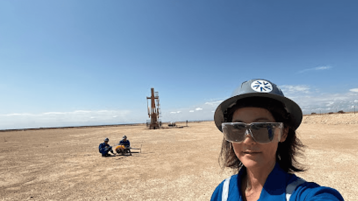
Customer Interviews and site visit
During my site visits, I spoke with both subsea and land inspectors to understand their workflow, needs, and pain points. Here's what I found:
Frustrating Reporting Process: Land inspectors rely heavily on reports for daily tasks, regulatory requirements, and reviewing historical data. The current system is slow, manual, and lacks an easy way to view historical data.
Critical Offline Mode: Subsea inspectors often face low or no connectivity, making offline access essential. They need all relevant information downloaded to their devices to work effectively.
Fast Asset Identification & Alerts: Both subsea and land inspectors need quick access to asset details and the ability to identify issues early to prevent catastrophic events.
Journey Map
After speaking with stakeholders and interviewing customers, I created a journey map and shared it with both internal teams and customers to ensure everyone was aligned and could clearly identify gaps in the current system. This process helped me pinpoint the key areas that needed improvement, including the Dashboard, Inspection, Report, and Search & Filter functionalities.
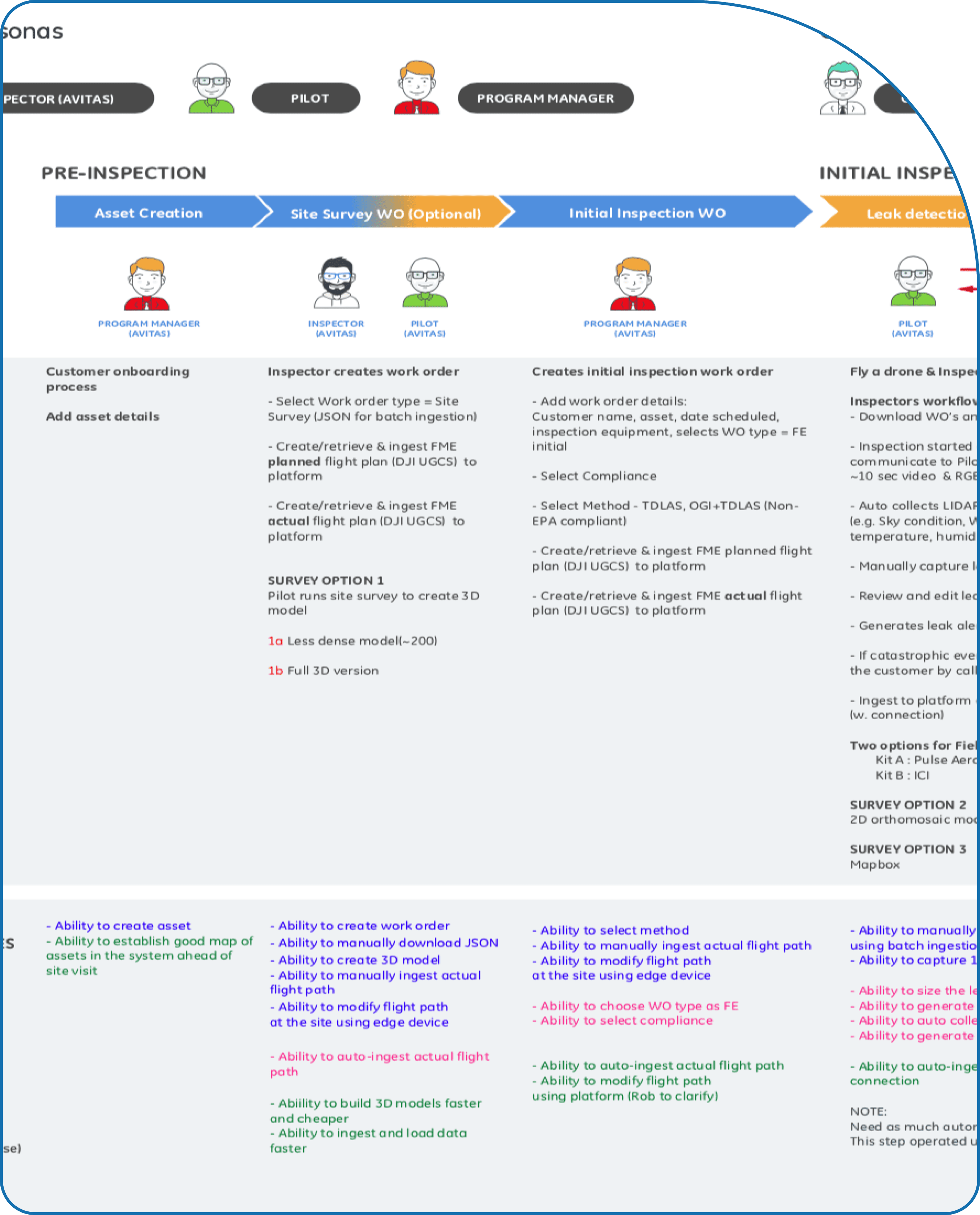
Persona
Customer interviews conducted through site visits helped me identify and define a target personas.

DESIGN
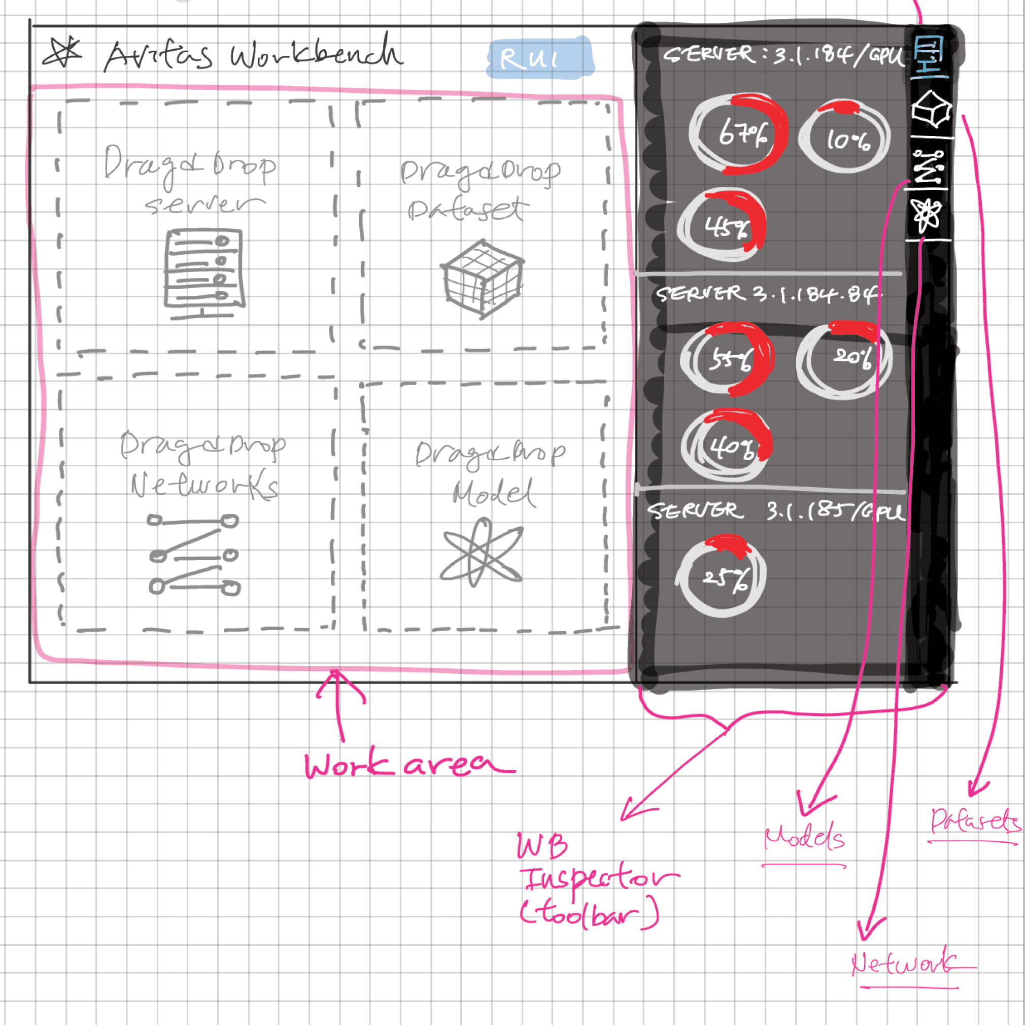
Sketches
Based on findings above, I started sketching of the concepts
Persona
After the initial design exploration and workshop, my design colleague joined the team, and we worked together, splitting up features to refine and improve each key area.
Design Component & Specification
Once the design was finalized, we started building the design system and main component libraries, using the Material Design system as our foundation.
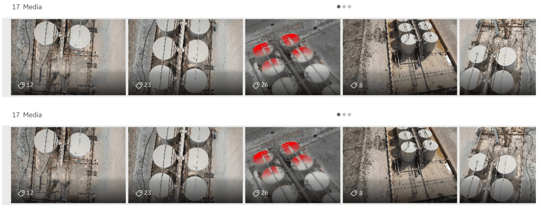
Image Carousel
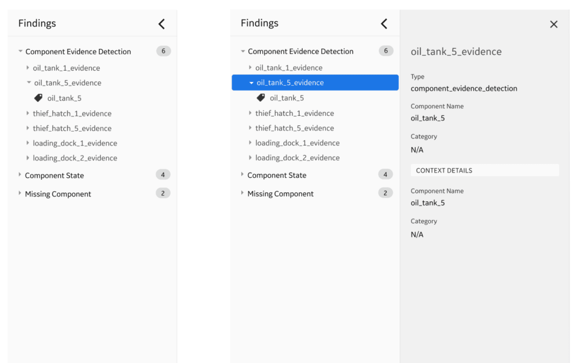
Inspection Findings Panel
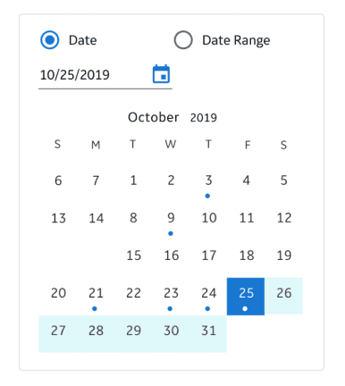
Date Picker

IMPACT
Transforming the Platform with Scalable Design
The redesigned platform received highly positive feedback from internal teams and customers. Making it fully CSS-driven significantly improved speed, consistency, and scalability across various industries. The new design became a standout sales demo, boosting sales prospects by 35% across multiple sectors.
100%
Positive Internal and customer feedback
35%
boosting sales prospects across multiple sectors.
Fully CSS-driven UI
Improved performance
Scalability across various industries
REFLECTION
Working as the only designer supporting PMs across various industries was challenging. I was balancing tight timelines for ongoing customer POCs while developing a scalable platform for multiple industries. This experience taught me to be proactive, adaptable, and flexible in different situations.
It also reinforced the importance of research. Even though PMs were domain experts, building a scalable solution requires diverse perspectives. Talking to the product team is essential to understand their needs, but it's not enough. Research is crucial to truly uncover pain points and identify opportunities.
Cross-collaboration and involving everyone in the journey are key to a project's success. Without digging into real problems, even the best design proposal is meaningless if it doesn't genuinely help users.