Workday
Improved Large-Scale Hiring with AI-Powered Solutions (NDA)
Led AI recruiting solutions for shift-based, high-volume hiring, aligning UX with product, engineering, and research.
Timeline
Jun 2024 - Jan 2025
Role
Sr. Product Designer
Team
0.25x UX Teammate
4x PM’s
6x Devs
1x Researcher
1x Content
1x Accessibility
Impact
Rate 4/5 – Easier for candidates to share availability
Rated 5/5 Streamlined hiring through advanced filter
Delivered a clear blueprint for integrating AI
Constraints
Legacy tech stack limitations
CANDIDATE PROBLEM
Work Availability input was missing in the apply flow.
Candidates struggled to share work availability clearly upfront. While companies can add it to their questionnaires, it's often buried and formatted inconsistently, leading to confusion and missed opportunities.
THE DESIGN GOALS
Make availability entry simple, clear, and upfront
We aimed to make availability entry simple, clear, and upfront—within the constraints of the existing Apply flow and framework—by reducing confusion, standardizing input, and placing it where candidates naturally expect it.
THE DISCOVERY
Journey Map
My design Teammate and I reviewed past research, explored AI hiring trends, mapped the candidate journey, and benchmarked competitors to identify gaps and opportunities.

CANDIDATE CONCEPT
Predefined, Custom & Broad time slot
After my teammate rolled off, I became the sole designer and focused on both candidate and recruiter flows. I began with the candidate side, exploring predefined slots, broad time ranges, and custom inputs to capture work availability within the existing application framework. While the team leaned toward quicker solutions, I advocated for a more scalable custom input. All concepts were reviewed for design system alignment, accessibility, and clarity.
Predefined Time slot
Option A: Standard time slots set by Workday for all customers
Rationale: Low cost, easy to maintain, and supports trend tracking.
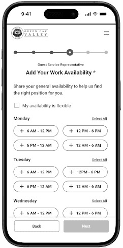
Custom Time Slot
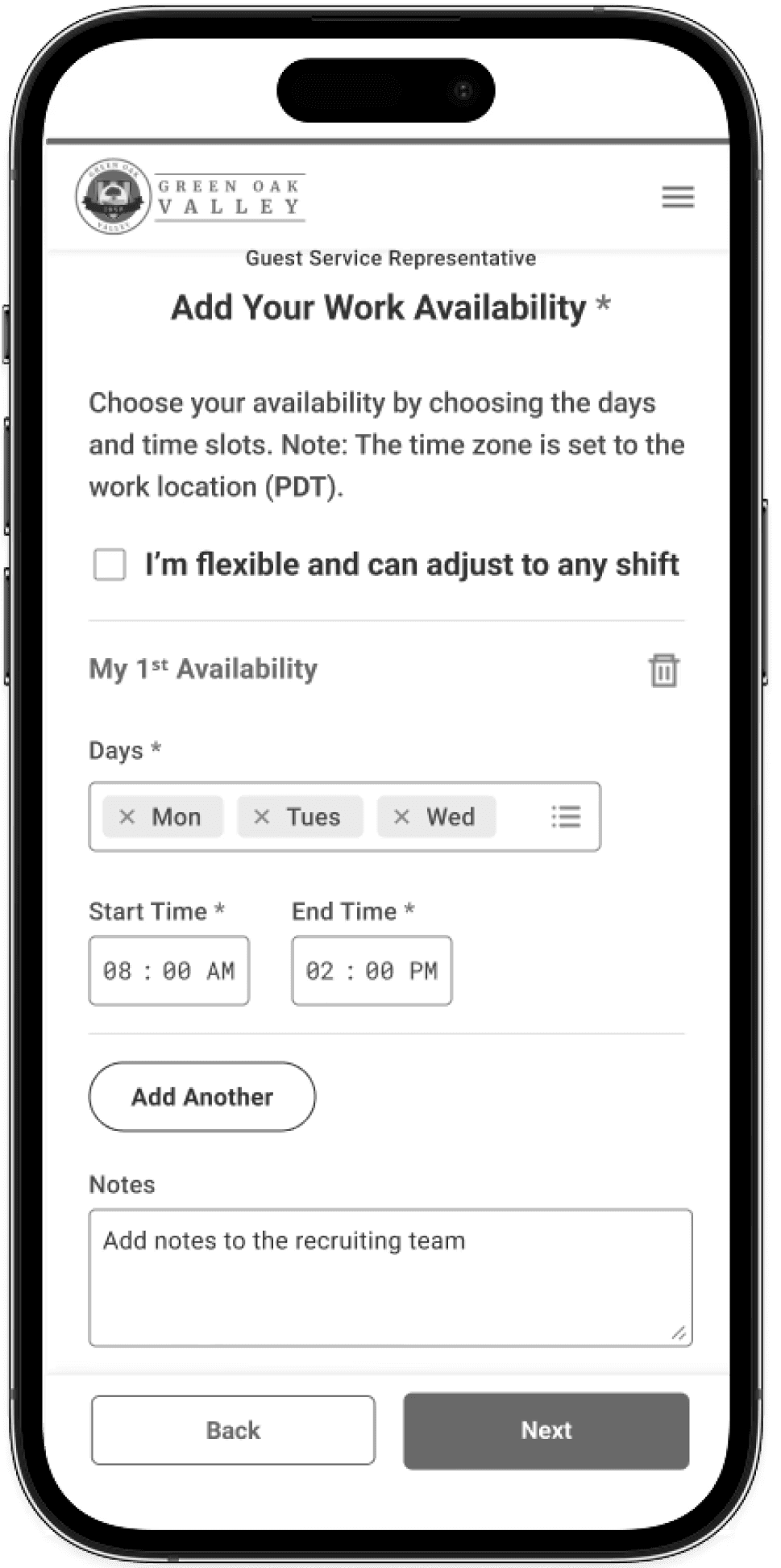
Option B: Candidates enter exact work availability.
Rationale: Highly accurate, improves matching, and scales across industries.
Broad Times of Day
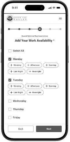
Option C: Candidates share general availability during application, recruiters gather details in interviews.
Rationale: Minimal effort, delays data collection to interview stage.
CANDIDATE USABILITY TESTING
After developing the concepts and prototypes, I shared them with the product team and collaborated with a researcher for testing.
Participant
7
Type
Moderated Testing
Industry
4x Retail
2x Healthcare
1x Manufacturing
Predefined Time slot
Pro
Easy to navigate
Cons
Layout felt cluttered
Confusing time slots caused inaccurate input
Custom Time Slot
Pros
Very satisfied
Clear availability input, easy preference communication.
Add multiple availabilities were well-received
Cons
Concern about employer fit
Broad Times of Day
Pros
Simple layout, minimal clicks, clear flow
Cons
Unclear definitions of time ranges like “morning” or “afternoon”
CANDIDATE FINAL DESIGN

Testing showed time preferences vary more by job type (full-time vs part-time) than industry.
I updated the UI to support both full-time and part-time jobs.
Key Updates:
Kept broad time layout
Added company-specific blocks for full-time
Grouped weekdays/weekends
Enabled custom slots and preferences for part-time
Users responded positively to the changes.
RECRUITER PROBLEM
Unoptimized Layout, Hidden Key Info, and Limited Filtering Slow Down Candidate Review

Wasted space on rarely used items - Important content pushed down, reducing efficiency.
Tabs not optimized - Candidate availability is hard to find, and resumes are buried in a separate tab.
Limited filters and space for candidate info — There’s no advanced filtering or search—users can only filter one column at a time, which slows performance. Key candidate details also get limited space due to unnecessary content at the top, forcing users to scroll frequently.

Too Many Clicks to Find Availability - Candidate availability is buried deep in the system, requiring multiple clicks across screens, which slows decisions and adds friction to the workflow.
THE DESIGN GOALS
Make it easy for recruiters to find key info by simplifying layout, optimizing space, improving availability visibility, and adding better search and filters.
RECRUITER CONCEPT
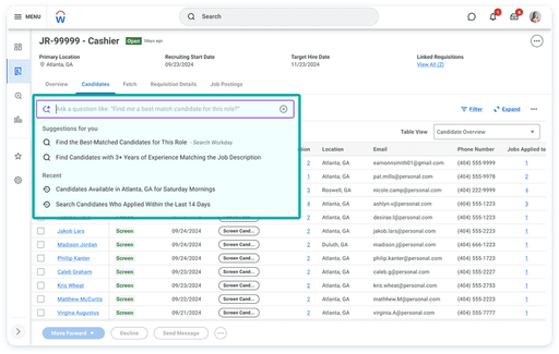
Availability Tab, AI Search & Advanced filters
Based on research, I started by improving the recruiter experience with a redesigned candidate table and explored filter and search concepts to help sort large candidate pools without relying on individual column filters.
General Table Improvements
Before

After
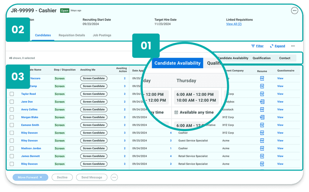
Optimized Tab Structure - Added Candidate Availability tab and merged Experience + Resume into Qualifications to reduce clutter.
Removed Steps Strip - Takes too much space and is replaced by new advanced filtering.
Added Job Req Summary - Provides a quick, at-a-glance view of job details based on past research.
Expanded Candidate List Area - Provides more space for viewing the candidate list.
Enhanced Search & Filtering Features
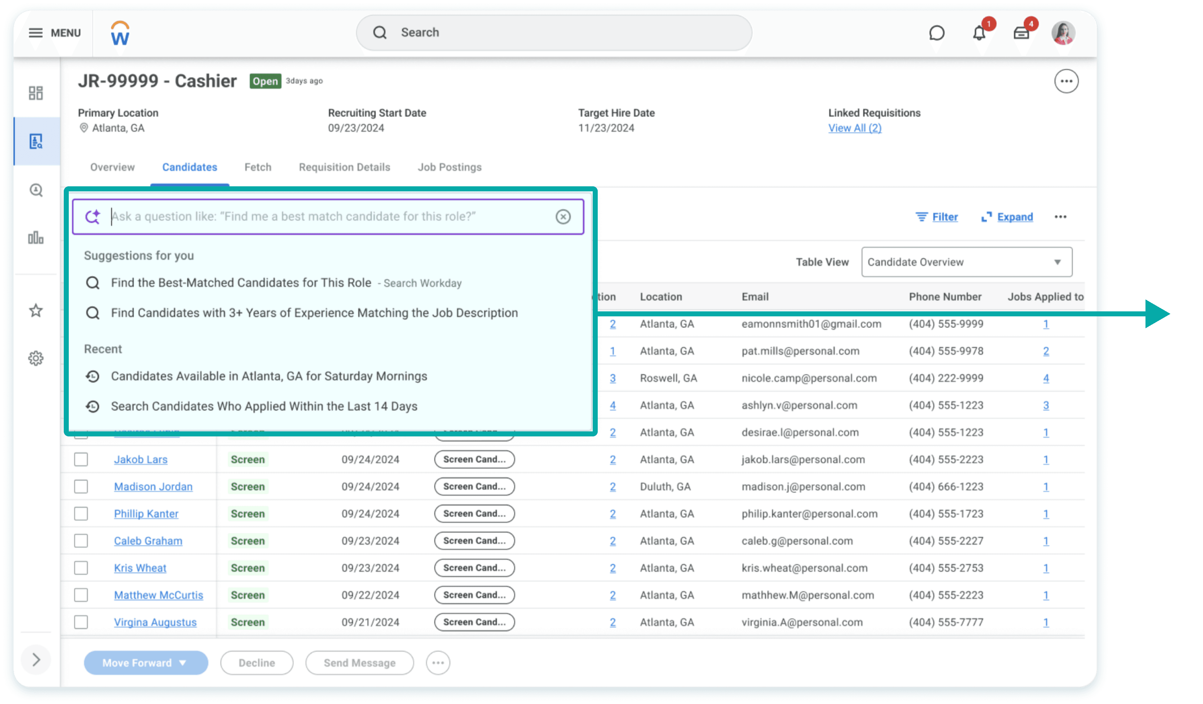
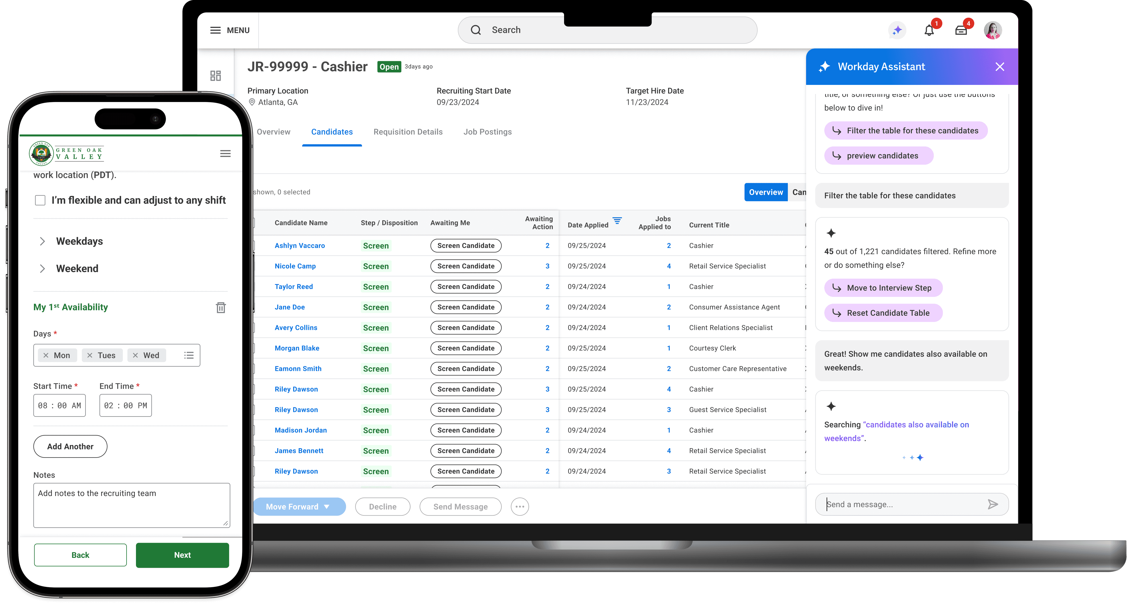
AI Natural Language Search: Leverages Workday's global search engine to enhance recruiting use cases.
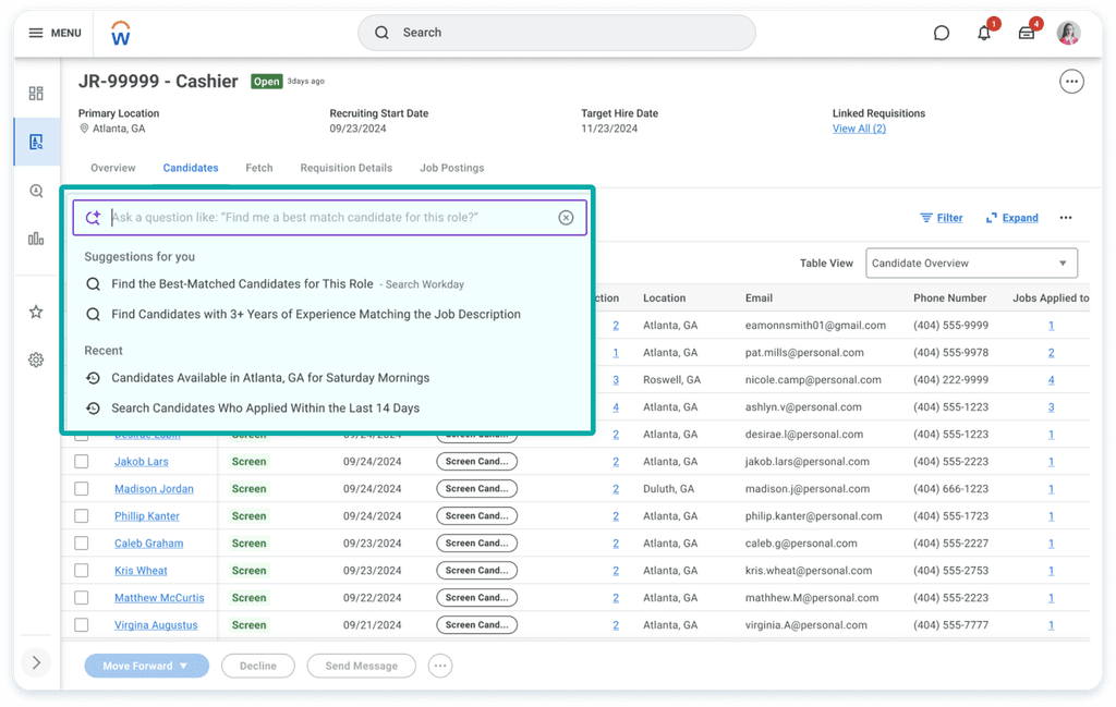
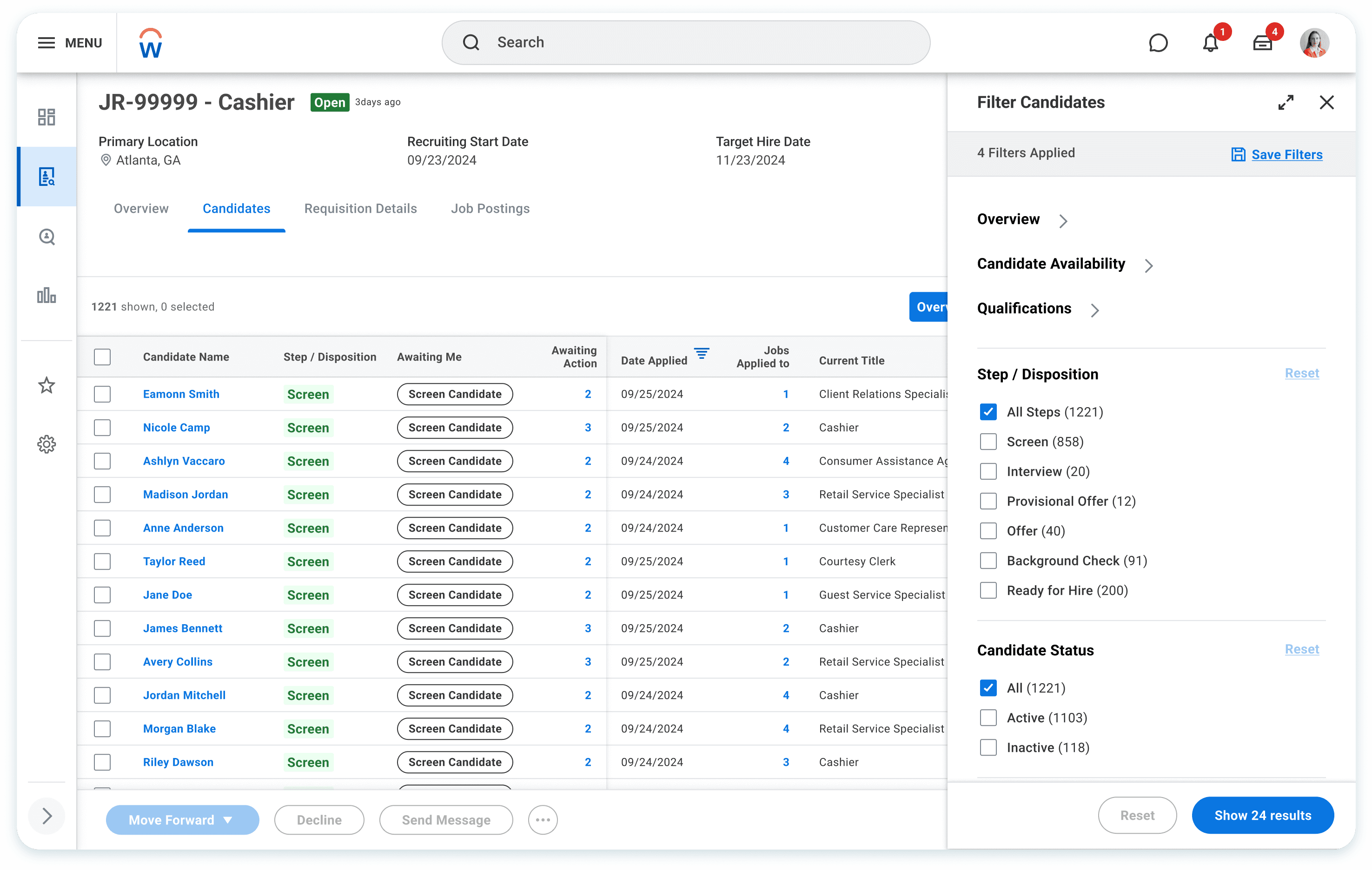
Consolidated Filter Panel: Enables multi-criteria filtering with a preview of expected outcomes before applying changes.
RECRUITER USABILITY TESTING
After developing the concepts and prototypes, I shared them with cross fuctional team and collaborated with a researcher for testing. We tested
Participant
7
Type
Moderated Testing
Industry
4x Retail
1x Hospitality
1x Healthcare
1x Manufacturing
AI Search
Pros
Users loved having a single, easy-to-find place for candidate availability and standard time blocks.
Users love how the natural language search and AI suggestions make finding the right candidates faster and easier.
Cons
Users feel unsure about what they can search for, aren't confident the results are accurate, and don’t fully trust the technology.
Advanced filter

Pros
Rated 5/5 by all participants
Loved having all filters in one place
Loved how filters quickly narrowed candidates and showed expected results upfront.
Found it easy to view and filter by availability
Cons
None
Pivot to AI
After testing, product leads suddenly pushed to fast-track AI. The existing Assistant didn’t work well for Recruiting, and legacy table updates were dropped due to an acquisition. I flagged the UX risks, teamed up with the AI team, built an MVP, and demoed it to get buy-in for a smarter rollout.
RECRUITER FINAL DESIGN

Key Updates:
Table Optimization - Redesigned the table to optimize space and better present candidate information.
Availability Access - Added a dedicated Work Availability tab to reduce clicks.
Improved Navigation - Reorganized tabs based on research to improve access to key details fast.
AI Enhancement - Enhanced the basic Workday AI Assistant to better support high-volume recruiting, enabling faster search and filtering.
IMPACT
Transforming High-Volume Hiring with AI Efficiency
4/5
Simpler for candidates to share availability and get better matches.
5/5
Quick access to critical candidate availability at a glance
5/5
Streamlined hiring through advanced filter that surfaced key candidate info.
Expanding AI in Recruiting, with early feedback from stakeholders signaling strong potential for future scale.
REFLECTION
Stayed flexible while juggling shifting priorities and tech limits across four PMs
Balanced fast delivery with scalable, long-term thinking
Embraced ambiguity and explored solutions beyond engineering input
Used early competitive analysis to stretch technical possibilities
Stayed agile in a rapidly evolving AI space, adapting to changing goals and tech