
Cisco
Cisco’s Cloud and Virtualization Network Management Group helps businesses and service providers manage their cloud-based and virtual networks more efficiently. The team focuses on making networks easier to control, more flexible, and secure.


Timeline
Aug 2017 - Aug 2018
Role
Visual Design Manager
Team
7x Visual Designers
3x Interaction Designers
1x Engineering manager
5x Engineering Leads
1x PM
1x Marketing Team Lead
3x UX Team Lead
Impact
Increase development efficiency by 40%
boosting sales prospects by 35%
Constraints
Tight timeline
THE PROBLEM
Fragmented UI, poor performance, outdated design, and brand inconsistency
In 2017, the UX and UI team was tasked with revamping the Cloud Network Management platform to be modern, scalable, and aligned with the new brand.
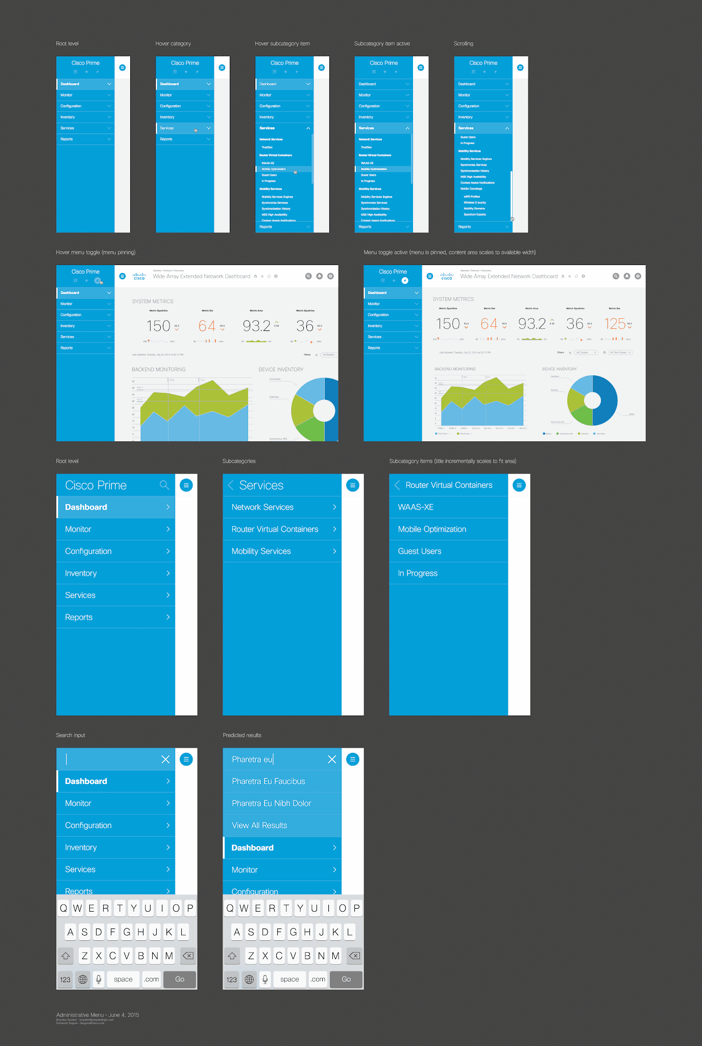
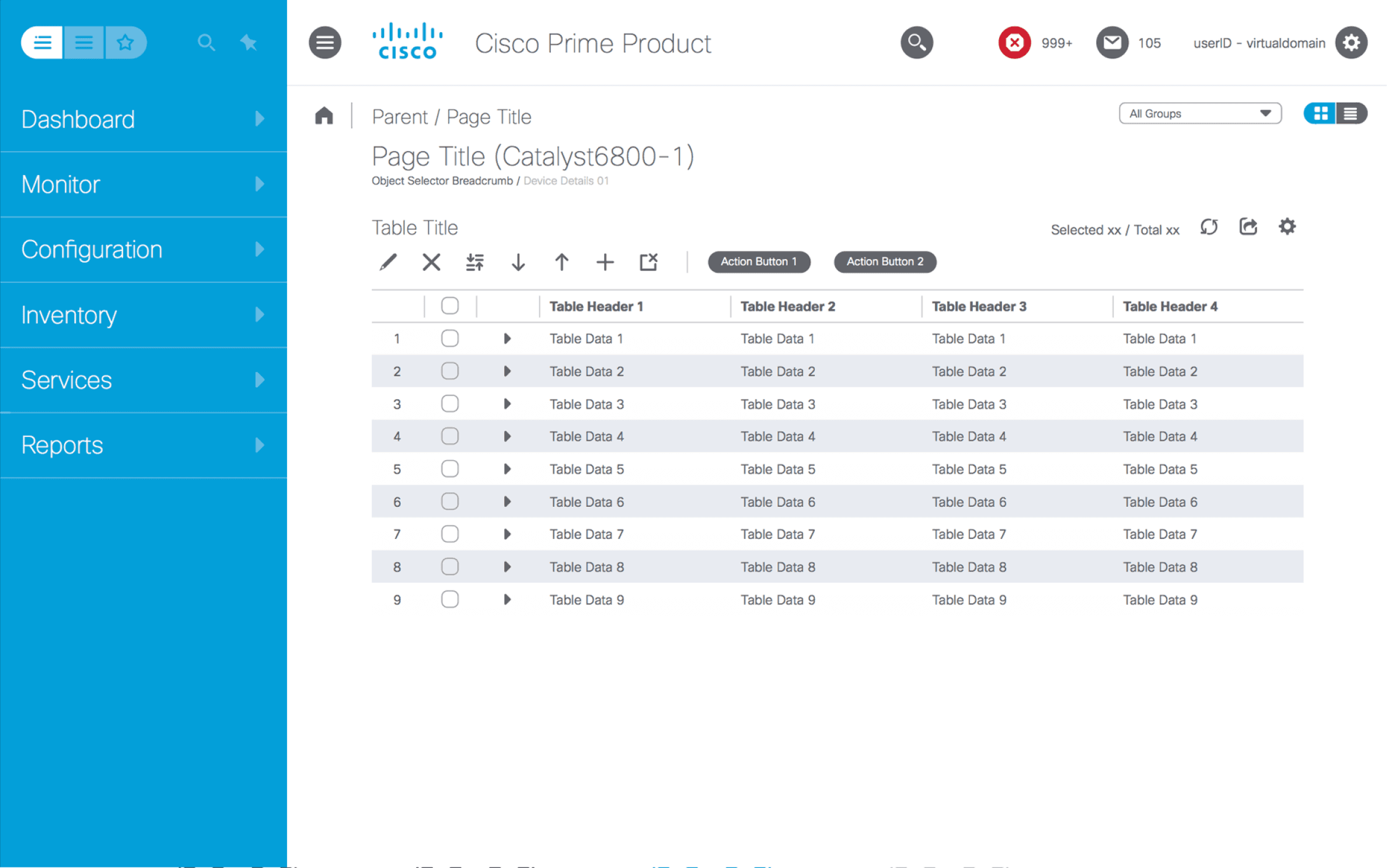
An agency was hired to create a new design guide, but it failed, costing us a quarter of progress and shortening our timeline. I stepped in to lead the effort, working closely with the UX and engineering teams. Within 10 months, we delivered a fully functional design system with 60+ components, including new visualizations, font icon sets, and page templates, making it easy for product engineering teams to adopt.
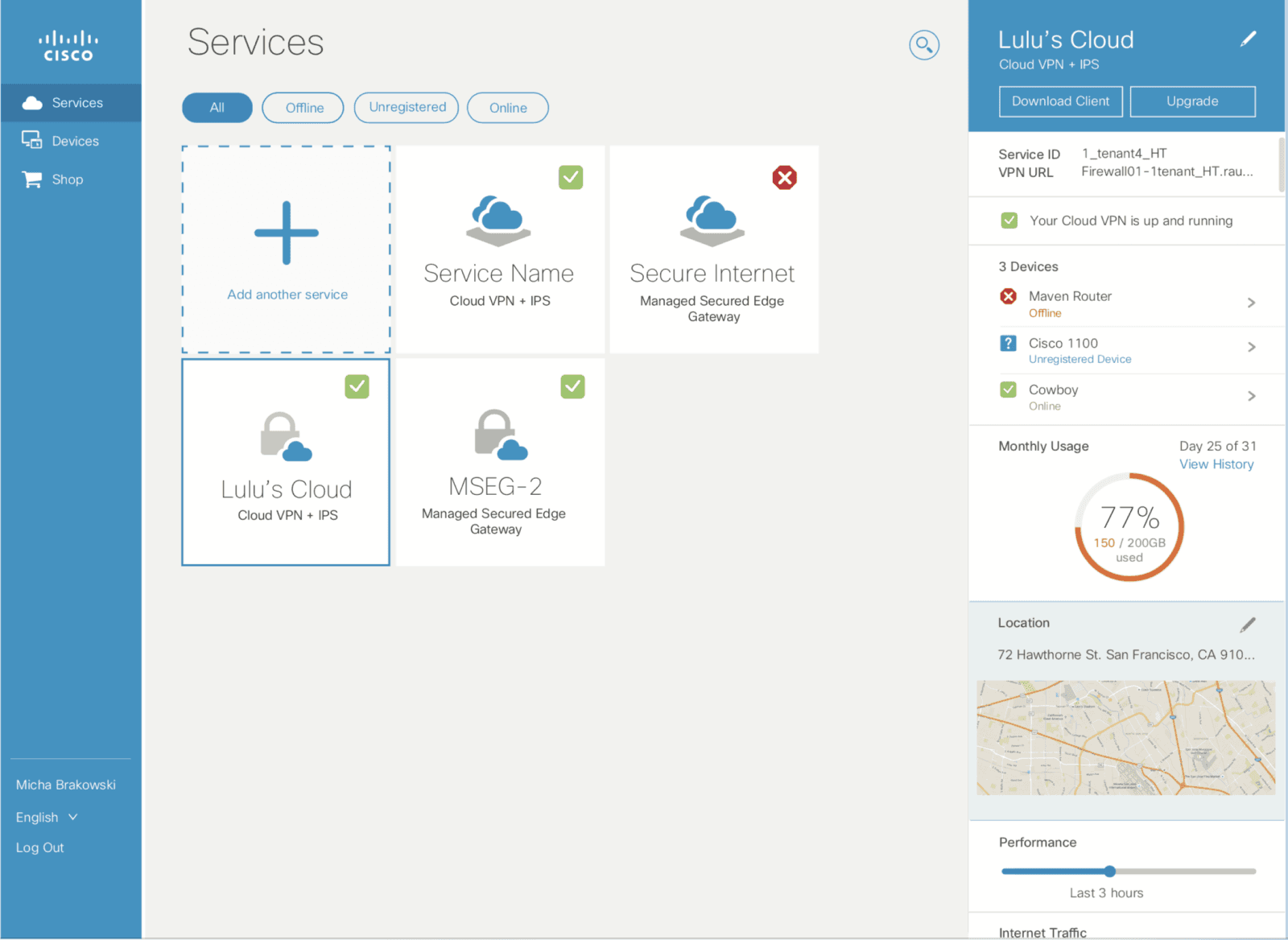
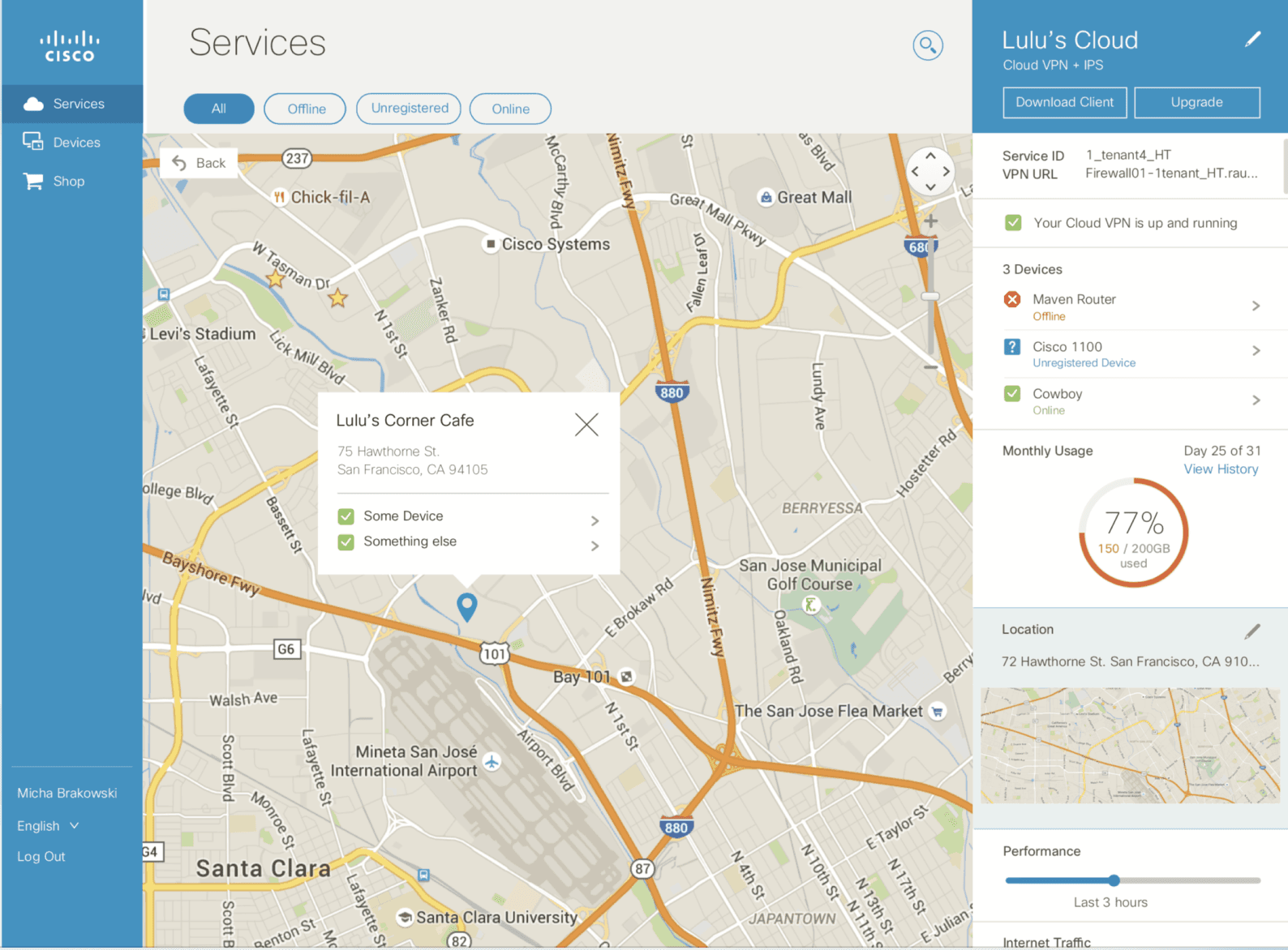
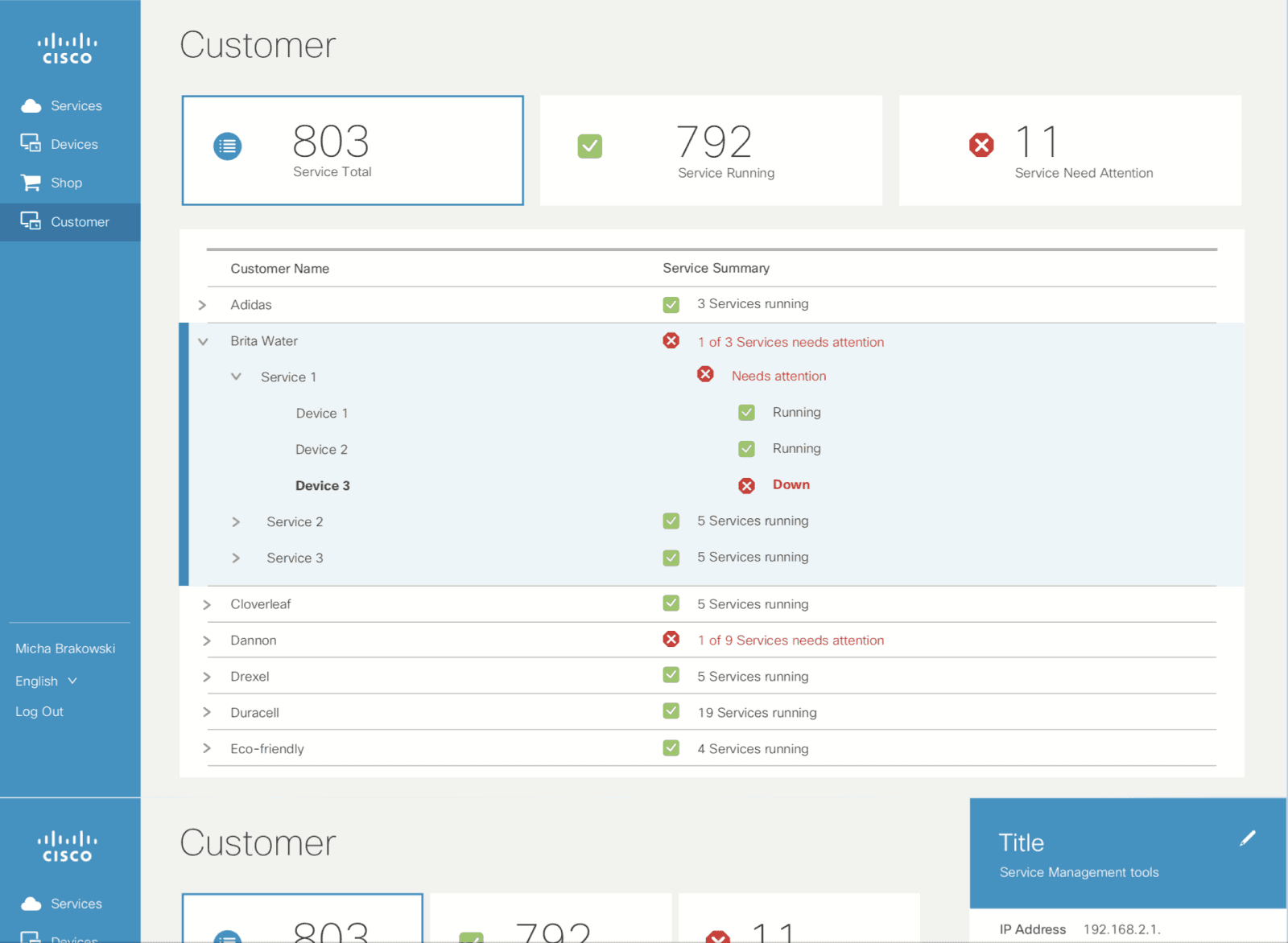
Before


What Works 💚
Soothing Color Palette: Users found the colors calming and comfortable for long-term use.
Useful Functionalities: The platform offered many valuable features that enhanced productivity.
What Doesn’t ❌
Internal stakeholder interviews revealed several areas for improvement:
Outdated look and feel
Muted, dull color palette
Overuse of icons
Non-compliance with corporate branding
Unclear distinction between alert and other chart colors
Clunky, non-scalable navigation
Limited space for content
Poor touch support
Inconsistent page designs
Slow performance
Messy, unorganized CSS
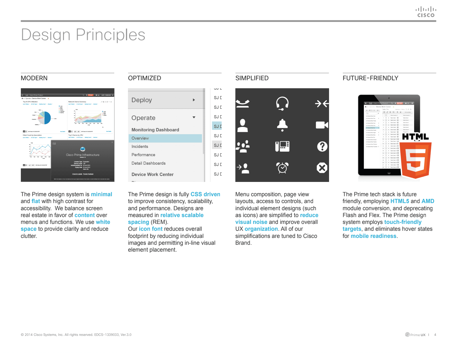
DESIGN GOALS
After internal feedback, UX and engineering teams collaborated to define key requirements and goals, focusing on:
Modernize
Optimize
Simplify
The circle size indicates the amount of effort dedicated to each goal.
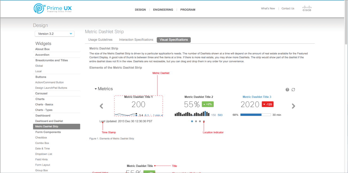
FINAL DELIVERY - 2013 ITERATION
Final Implementation
Design Styleguide
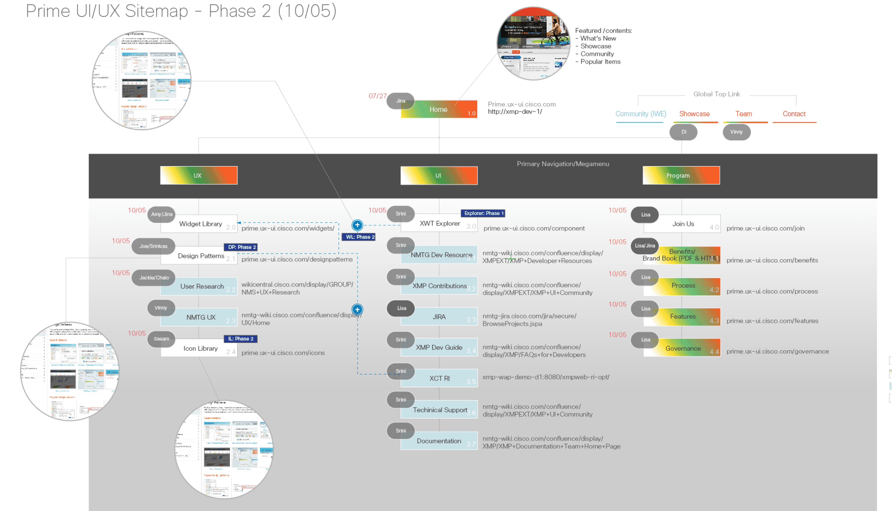
Standard Site - Site planning map
Standard Site
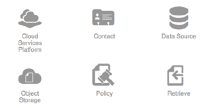
Icon font
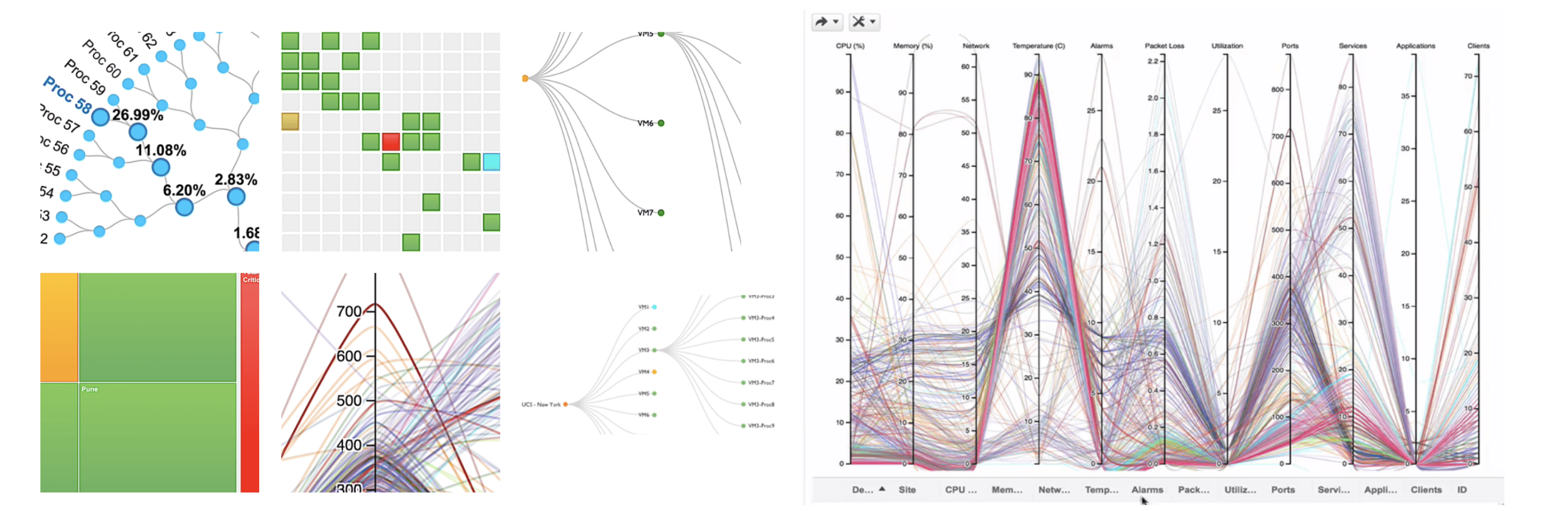
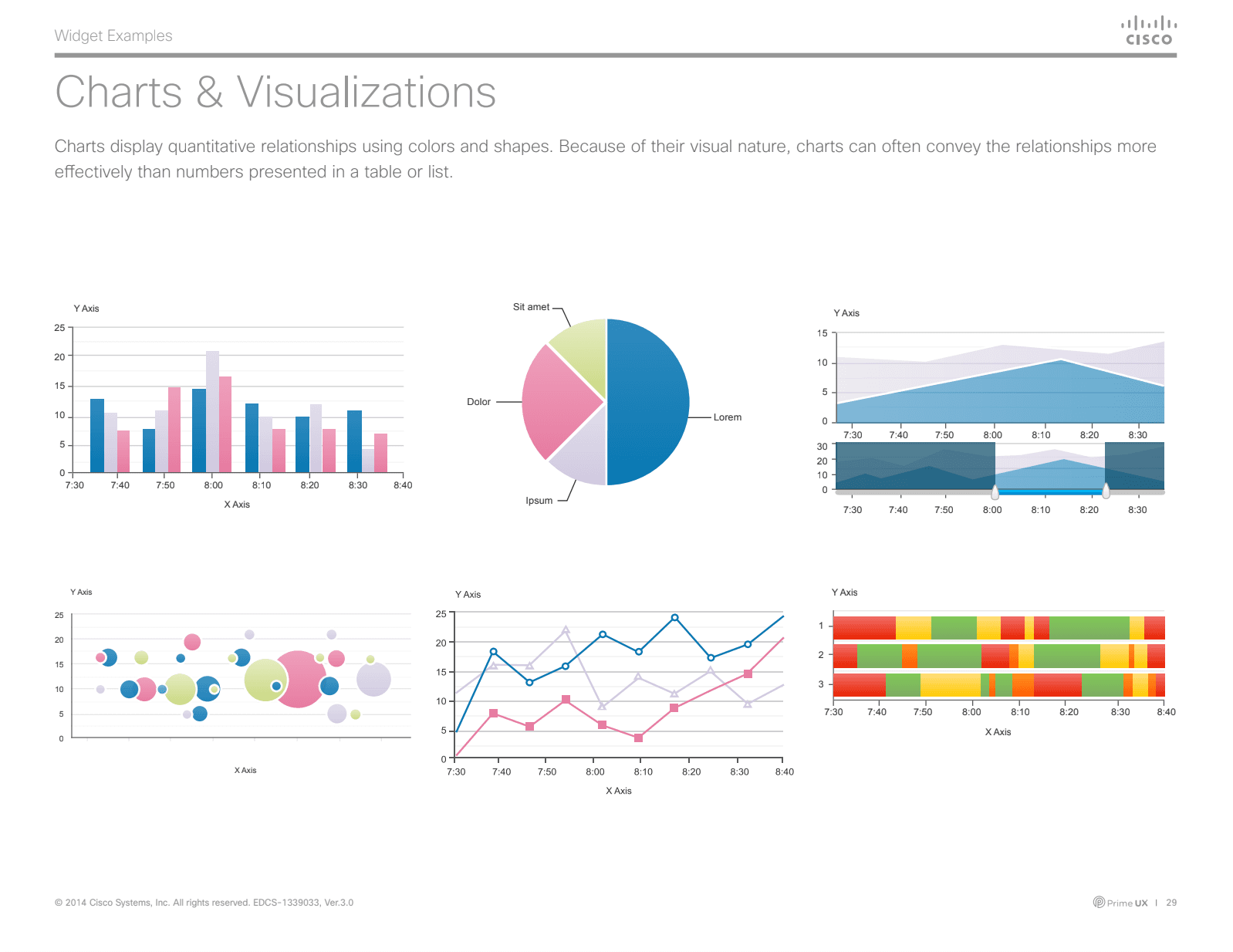
Data Visualization: Assisted developers in redesigning and enhancing functionality.
The following items were successfully delivered within 12 months.
Streamlined Icon Styles: Reduced 5 icon styles to 2, improving performance and reducing costs.
Developed Standardized Page Templates: Delivered 4 page templates to enhance adoption, ensure consistency, and reduce QA effort and bug fixes.
Built Comprehensive Component Library: Delivered over 60 components, including 6 advanced visualizations.
Aligned with Corporate Brand: Ensured all designs adhered to the company's branding guidelines.
Created Design Style Guide: Provided guidelines for external teams to maintain consistency.
Built Design Standards Site: Developed a dedicated site to document and share design standards.
Second Iteration in 2015
Overcoming Resource Challenges
with an Agency Partnership
Two years after the first platform refresh, Marketing introduced a new design language.
With internal resources tied up, I was tasked with creating a design guide based on the new brand system. I chose the same agency that worked on the Cisco brand—more expensive, but their familiarity made onboarding easy.
Working closely with them, I delivered the style guide within a quarter. However, the marketing-focused brand lacked details for complex network use cases, like overly large spacing. Weekly meetings with the agency helped us iterate and stay on schedule.

Corporate Brand Initiative
Second Iteration in 2015
Cross UX Team Alignment
While working with the agency, I collaborated with four teams—Marketing, AUESSome, Futurama, and SMX—across the company to align on login, header, icons, font style, spacing, and notifications, as these were not defined by the corporate style guide.


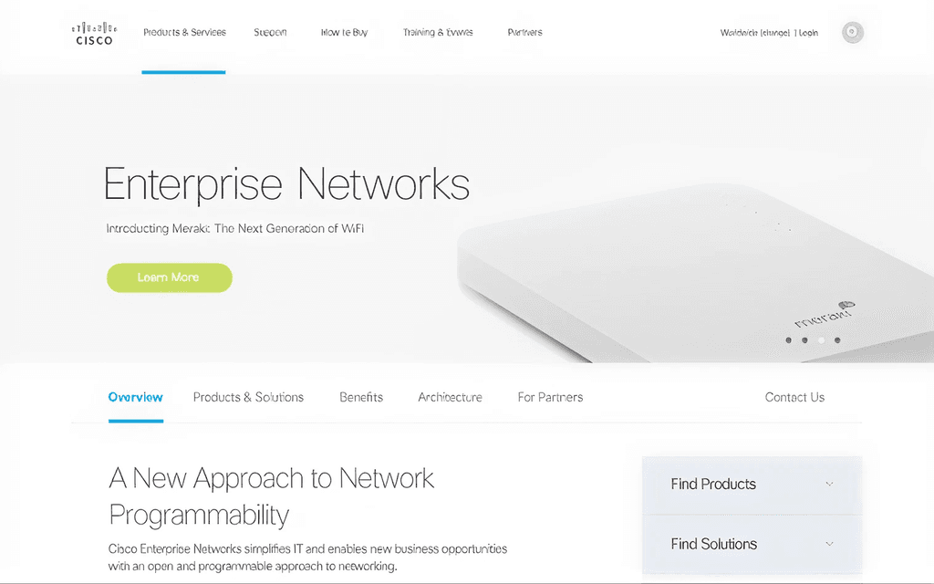
FINAL DELIVERY - 2015 ITERATION


New Design
New Design - Helped guide the designers to adopt the new design guidelines
IMPACT
Transforming Widget & Platform Design: From Outdated to Optimized
My design, product, and engineering partners shared our work company-wide, sparking strong interest in adopting our well-developed and highly functional design system.
Here's the detailed outcome table.
75%
Reduction in assets
3x
Increase in company-wide adoption
80%
Code reduction via streamlined CSS and page templates
REFLECTION
This project demanded intense collaboration, hard work, and overtime to make up for the quarter spent onboarding the agency. But all that effort paid off. I’m incredibly proud of what the team and I accomplished. It showed me the power of close collaboration, constant feedback, and valuing everyone’s perspective.
One strategic move my engineering partner and I made was partnering with technical visual team members to work directly on CSS with engineering. Instead of the usual process of completing specs before coding, we worked simultaneously, which sped up development and ensured accuracy. It was a game-changer for fast, high-quality delivery.